GETTING THE BEST OUT OF INFOGRAPHICS AND DATA VISUALIZATION
Data is, and always will be, key to any business in leveraging insights into initiatives or objectives that will give you that competitive edge.
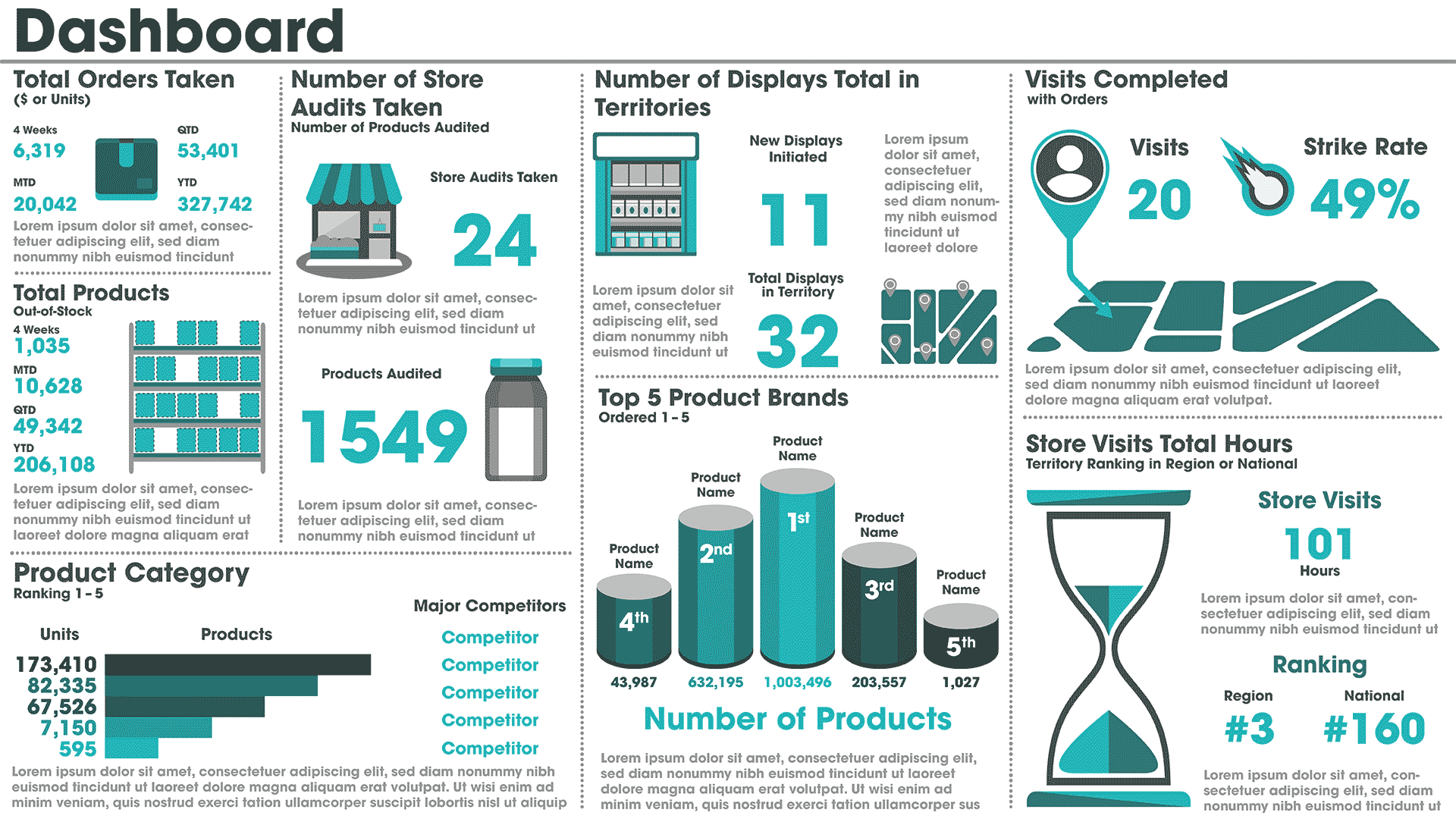
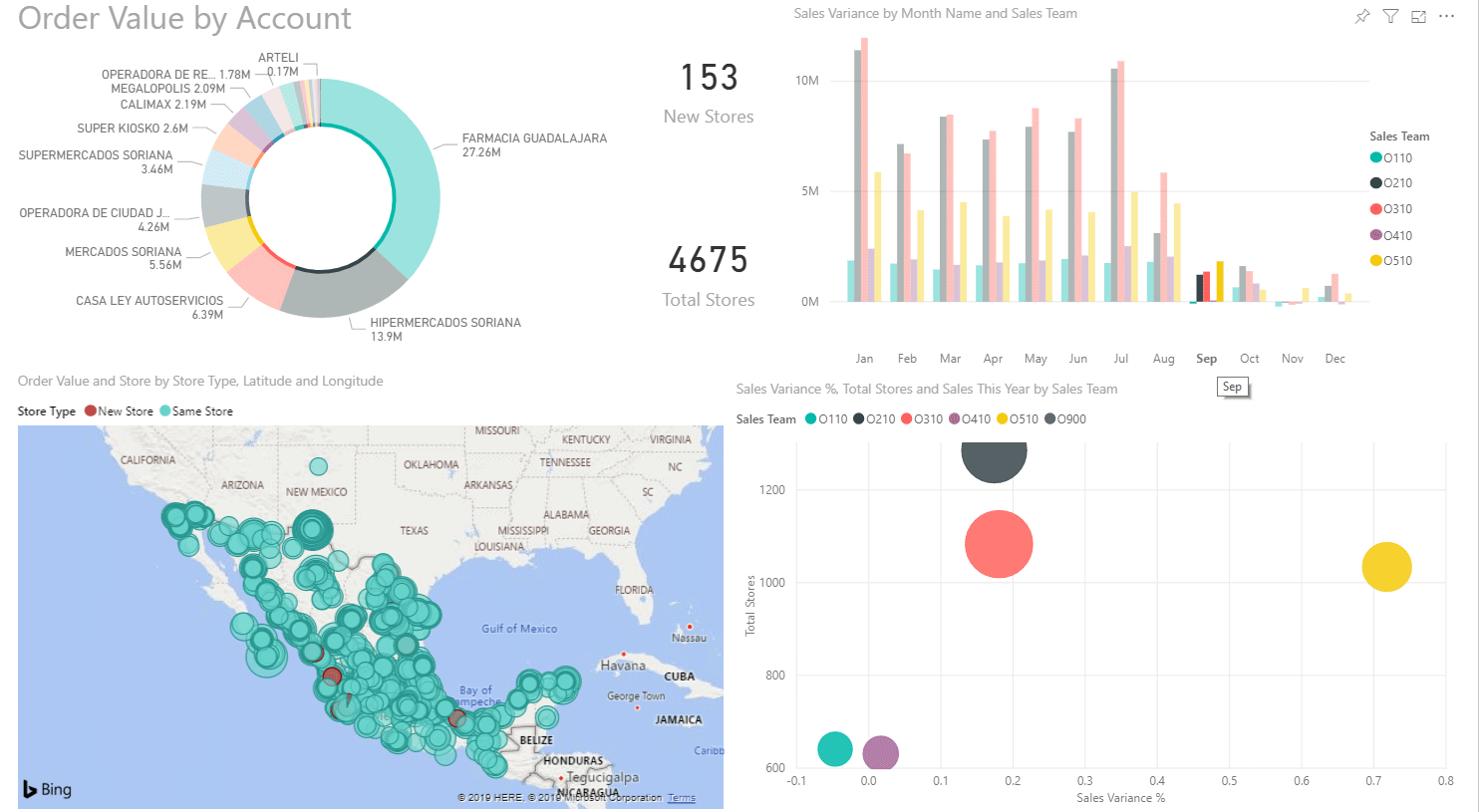
Many business intelligence (BI) tools offer similar insights, hindsight and foresights into past, present or future data points, but what really is taking hold is the new paradigm shift to more intuitive reporting, focusing on more visualizations and graphics that play on human cognitive abilities.
Graphics are easy to digest, easy to interpret and quick to get a complex piece of key data to you, so that data mining the details is not necessary. Most avid readers of news articles will review an infographic before proceeding to read the article, as the infographic portrays the exact essence of the article. BI tools are naturally moving to this new design, and away from the standard grid/line format, but how effective are visualizations, and how ubiquitous will they become?

FRONTLINE DATA
Take for instance Brand Market Share in a report – it is usually represented as a percentage and should never be drawn as a bar graph with Brands juxtaposed next to one another because, obviously, the Total Market value is a finite value; the sum of all the parts cannot be larger than the sum. The most obvious visual would be to represent the sum as a whole, such as a pie chart, not bars.
All basic stuff, and sounds obvious, right? Be that as it may, the choice of even the simplest of charts all comes down to the underlying question of data representation: What do you want to achieve by them? And more importantly, who is the audience? Gone are the days when report specialists would build reports just for managers. Insights into data are now more than ever just as important in the hands of the sales reps, who are making the connections as well as communicating and building the relationships with the store managers.
And they need the data NOW, in REAL TIME, and presented in a way that makes sense given their limited time in-store for selling.
CONTEXT AND CORRELATION
Let’s use another example: A grid of numbers can be meaningless without context. Context needs correlation, and together, the end consumer just needs guidance, not a degree in Mathematical Statistics to interpret the information.
All Dashboards in the BI world are meant to do the same thing – provide a high-level overview. However, some of the previous standard visualizations may have outlived their worth. Take dials for instance. A dial is a perfect physical manifestation of a visual – it’s a gauge and a visual representation of several numbers of where you are and where you can be. It’s good for oil pressure, but is it still appropriate for Sales Dashboards?
Most report specialists are not Data Scientists, and more than likely, most dashboards created by them in BI tools show dials, which are simple and appear effective, but they seem to have the same challenge as the Market Share bar graphs. They represent a varying degree of units in the same graphic space – in a CG world they can represent Total Sales, Total Visits or Total Displays– all three are represented by thousands, hundreds and single units, but they all are represented in a simple half-sized dial.
Why?
If you want to show the height of a tree in a graph, would you place it in a dial next to a dial showing the weight of a rock? Or, would you be more effective presenting the tree as a visual? It’s a paradox but dials are universal and have been the default Dashboard component that we all have been accustomed to. Choose visuals, where appropriate, to get the most out of the detail.
Another example are sparklines. Seems like a gimmick – but try comparing a range of sparklines of data next to a bar chart or grid of the same data and watch your natural cognitive skills kick in!
STAYINFRONT AND VISUALIZATIONS

At StayinFront, we are exploring all the capabilities to answer the questions of effectiveness of Visualizations and Infographics, but we understand they must be within the right context. There is no sense in our customers investing heavily in BI licenses for the best visualization tools and then providing simple grids and line charts to the users because that is what they are used to. “Know your audience” they say, but the audience is varied.
We need to combine Infographics and Data Visualization on dashboards and in reports that satisfy all audiences but can also help the sales rep out for direct store delivery. It is important to provide gamification to help drive success, but furthermore, to provide the data specialists with tools and reports that allow greater ability to drill into the specifics. It’s a big task, but it’s an important one to get right, and there are many BI options out there.
StayinFront is taking the path of this new paradigm shift and embedding what we perceive to be the best, most pertinent graphic options that get the most out of the complex data strategies embedded into our tools.
David McGuinness, Vice President of Information Systems for StayinFront, has worked for StayinFront in its New Zealand, United Kingdom and United States offices, bringing meaningful data visualizations to StayinFront’s clients in the most effective implementation possible. Prior to working for StayinFront, David was employed in London at the multinational investment bank Société Générale, and previously held a technical role at the world’s most famous department store, Harrods.

Follow his posts and activities on LinkedIn here:
https://www.linkedin.com/in/david-mcguinness-3928633/
www.stayinfront.com


